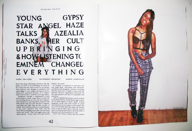
Is art better than graphic design?
Analysing what makes the
two so similar and/or different and why this is.
By art this essay
refers to the disciplines of painting, fine art, sculpture and possibly
conceptual art- the sort of art in other words that one might expect to find in
a gallery. GD on the other hand is seen as a consumerist form of creativity
existing as packaging, branding, publications and advertisements.
Traditionally
Graphic Design has been considered separate from the world of fine art. Although many may accept graphic design
as a creative subject alongside art or ‘different institutions, different
organisations… practising the same for of creativity’ (Barnard, 2005, 177) it is
clear that the two share some key differences, but also important to remember
that they share similarities that tie them together.
So how are the two
similar? Both art and graphic design at their hearts serve the purpose of
communication, they exist in order to pass on a message. In an article entitled
Art and Communication, Rex Crockett
describes art as a ‘certain kind of specialized
communication’ (Crockett, 2006), he describes art as a quality
of communication that possesses a strong enough level of craft to allow the
object to transcend its original function.
‘Craft becomes art when it
breaks away from mechanical functionality and begins to “emanate.” One’s
personal appearance becomes art when it transcends the purely functional. One’s
life itself becomes an art form when it becomes something more than mere
survival.’ (Crockett, 2006)
Pieces such as The Annunciation, (1672) painted by Luca Giordano (fig 1) and The Vocation of Saint Aloysius (1650) painted by Giovanni Francesco Barbieri (fig 2) were produced in
order to communicate stories from the Christian faith in a way that could be
understood by a public devoid of the ability to read or write.
Art also generates communication, for pieces that have no obvious meaning or no
knowledge of the artist’s original message a gap emerges, leaving an artistic
piece open for personal interpretation with an audience. A perfect example of
this is Giorgione’s The Tempest
(1507) (fig 3.), a masterpiece whose original message is lost to history and a
painting that has been debated by experts of art.
Graphic design is
also communication; it is often referred to as a visual language. Every piece
of good graphic design is crafted to convey a message spoken in the correct
tone and targeted at the right person, all through the mediums of text and
image. Usually the message is one of motivation, the Levi’s posters motivate us
to buy Levi’s jeans and the recycling leaflets motivate us to recycle. No
matter the medium or the context be it publication or packaging design, logo or
layout, the communicated message an audience takes away from design is the
driving force behind every design decision.
There are a lot of
cultural connotations attached to art; the first is that artists paint for the
soul whereas designers produce for the pay packet. This is of course a
misconception, both mediums have the same restrictions placed on them when it
comes to money, an artist needs to eat just as much as a designer and in both
cases what is produced has to, eventually be sold. The reason for this belief
comes down to the second cultural connotation, and this one surrounds the
artist. The artist is often portrayed as a ‘genius’ or a ‘visionary’, depicted
as a tortured soul who lives rough, reads the world and translates it onto a
canvas. Such classic examples include, Van Gogh, who supposedly lived in slums
and squander, torture and torment and modern examples include Damien Hirst, who
spent many years living in a squat.
The
aforementioned artists are considered geniuses because of these real world
experiences. However these myths blur the facts of their situations, in reality
Van Gogh was only able to paint because his brother financed him entirely. And
with Damien Hirst, his biggest piece entitled ‘The Physical Impossibility of
Death in the Mind of Someone Living’ (fig 4) (a tiger shark preserved in
formaldehyde) was conceived with, paid for and sold by Charles Saatchi over a
café lunch. The piece went for a hefty price before the gallery doors even
opened (and Saatchi managed to spend a total of £56,000 of his own money
producing the piece). For both
artists and designers,
‘What is produced has,
eventually, to be marketable in order for the ‘artist’ to be able to live. Even in the limit cases, there is
something like a client and the ‘artist’ is constrained to produce something that
‘end-user’ will want to buy.’ (Barnard, 2005, 165).
And despite the romantic,
naive view of art and its supposed influence on culture, it has to be
recognised and accepted that ‘no culture can develop… without a source of
income.’ (Greenberg, 1939).
When it comes to cultural significance art is known as the symbol of
culture and cultural language, depicting religion, key events, people and
opinions through varying mediums. In society, it is usually the fine arts that
are considered to be the best way of representing a culture due to its
expressive and creative nature. For example Franz Kline’s piece New York (fig 5) can be said to
communicate the cultural attitudes of New York, its simple calligraphic strokes
and sharp angles connote not only the modern metropolis that New York is but
also the sharp and heated nature of what it is to live there. The roughness of
the edges depict a world much darker when viewed up close and the suffocating
closeness of some of the line work is a representation of the compact living conditions
with flats, sky scrapers and people all squashed into a space far too small to
accommodate them all. Be it through personal opinion or direct representation
art is viewed as our direct example of cultural authority.
‘Art has been a way to communicate
beliefs and express ideas about the human experience throughout all stages of
civilization and in every region of the world. As cultural documents, works of
art provide important insights into past and existing cultures, helping us to
understand how others have lived and what they valued.’ (Art Through Time 2013).
Graphic Design is
also a medium through which culture, society and everyday life can be
communicated, all be it a very recent one, and in my opinion it is a far better
representative. Graphic design is everywhere and it is nearly impossible to go
through an entire day without bumping into examples of it. We interact with it
almost all the time, be it through products and packaging, layout and
publications, web or media, posters or advertisements. As it becomes a part of
our lives it also becomes a part of our culture, such examples as the Rolling
Stones tongue (fig 6) or the Coca Cola Logo (fig 7) have been transformed from
logos into fashion symbols; you can now purchase the Rolling Stones tongue on
t-shirts and posters and the Coca-Cola logo not only has its own branded furniture
for sale but also has recently released it’s own line of shoes.
Some may say that this
doesn’t make Graphics a suitable cultural representation due to it being so
closely linked to consumerism, however at its heart what truly makes culture is
choice and enough people choosing it. On it’s own taking a photograph of
yourself and posting it online doesn’t seem like too great of an action but
when done ritualistically by millions of people it becomes a cultural
statement; it may not be pretty and it may not be sophisticated, but it is a genuine
and real representation. Graphic Design is the same, not every design may be
pretty or artistic or intelligent but it is real, it is used, interacted with
and absorbed. Like it or not we all know brands, we all recognise logos and we
make choices consciously or subconsciously which will go on to have a greater
effect on public in general and the shape of our culture.
Another way Graphic
Design can be argued to represent culture is through the way design decisions
are influenced; the key factor in any design choice is the preference of the
audience you are targeting. For any piece of design to be effective the target
audience must be considered and understood; the designer will not select
colours, fonts or images based on what looks good but based on what clearly
communicates the intended message and what audience he is appealing to.
Attempting to communicate to a target audience requires the audience understanding
your choices and the overall message and to do this designers rely on existing
cultural connotations.
If we want something to
look fresh or environmentally friendly we use the colour green which usually
connotes leaves, grass, health and freshness. A good piece of design relies
upon previously established stereotypes and connotations to communicate a
message or strengthen a pre existing one, in this way ‘Certain advertisements,
posters, packages, logos, books and magazine endure as sign posts of artistic,
commercial, and technological achievement that often speak more about
particular epochs or milieus than fine art ’(Heller and Pomeroy 1997).
Although both Art
and Graphics share strong similarities there are also key differences between
the two, which, despite them both being creative forms of visual communication,
does make them distinctly different. The first is a question of inspiration
over motivation, as previously stated, art and graphics hold communication at
their heart: the out come of that message however is different. Good design is
supposed to motivate you; every piece
of graphic design has at its heart a purpose whether its attempting to sway
your opinion in the form of a pamphlet or make you purchase a certain brand of
cookies with an advert, they do this by relying on cultural connotation already
existing within society, ‘The
designer’s job isn’t to invent something new, but to communicate something that
already exists, for a purpose.’ (O’Nolan 2009)
If graphic design is produced and received effectively the
audience response would be to do something, to buy this product, to go to this
event, to sign up for this news letter, to choose Tesco over Asda. On the other
hand good Art should inspire you, the
artist does not want direct communication but rather considered, the point of
art is to create an emotional connection and response with it’s audience and to
allow intelligent interaction from its public through personal interpretation
of a piece. The underlying principle of a good artist is to attempt to convey
something new, to communicate in an entirely never before seen way
‘Many artists chose to stand apart from worldly life in order to
critique it… Although [they] claim to address their art to the world, their
method has been to take from the world only on their terms and give back as
they see fit. This is definitely not the way of design, which considers the
world's purpose first and fits the work to that end.’ (Brady, 1998)
Next we must look at
how art and graphic design are interacted with by their audiences. Art exists
to have multiple interpretations: although an initial message may have been
considered during the creation of the piece the whole point of art is that of personal
meaning and self-interpretation, “art connects with different people in
different ways, because it is interpreted differently” O’Nolan 2009) When we
view art, the end goal is for us to develop our own opinion on what a piece is
communicating and unlike design there are no rules that bind the craft. The
reason an artist produces art is for a personal purpose, for the sake of
creating beauty and for the sake of an audience member finding some form of
personal truth (inward looking or societal) within a piece, it does not need to
function in the way design does and it does not need to have an single message
that everyone will walk away with. “Art strives to
achieve beauty, which is truth… Practical success is not the hallmark of art…”
(Brady, 1998)
In contradiction to
this, examples of Graphic design have one meaning and one message, they are not
created to be interpreted they are created to be understood. Design is produced
with the intention of doing a single job, be it informing people not to step
over the yellow line at a train station or persuading you to go along to the
Debenham’s Blue Cross sale, and throughout its production every design choice
will have been made to further communicate this one single message. In the eye
of artist if someone were to interpret their piece differently to how they
intended it would probably be considered a success, in terms of design though
if anyone were to take away anything other than the intended message, the piece
of design is considered a failure.
‘Does the design serve the product? Does it accomplish an end--does it
sell, inform, persuade, direct, or entertain? If it doesn't get the job done,
the design is considered not good, or worse, not successful.’ (Brady, 1998)
This is something that can be said to be true of all design, it does not
think of aesthetics first but purpose and can either be considered successful
or unsuccessful, never good or bad.
This leads us on to
the next key difference between art and design, the difference of taste and opinion.
The key factor in judging design is did it do its job? (Was it successful?) And
how well did it do it? (How successful was it?)
‘A good piece of design can still be successful without being to your
taste. If it accomplishes its objective of being understood and motivates
people to do something, then whether it’s good or not is a matter of opinion.’
(O’Nolan 2009)
Although graphics certainly requires a taste or style, it is not the
main function of a piece of design. Whether a designer likes a piece or not
cannot take away from its success in communicating to an audience, he may not
like it, but he can appreciate its function and the point it manages to
achieve.
‘While design naturally involves an element of personal taste, it’s not
the main criteria it’s judged on. Good design can still be successful without
being to the personal taste of the creator or the beholder’ (Roper 2013)
On the other hand
art is a matter of taste, being a connoisseur of art doesn’t come with the
assumption that one will like and appreciate all forms of art. A follower of
the Impressionist movement may consider conceptual art a joke to the subject
and an abstract artist may find photorealism far too confined and restricting.
The key example that appears in many articles on the subject is the 1999 turner
prize shortlisted My Bed (fig 8) produced
by artist Tracy Emin. It was a piece that divided the opinion of the art world
into two very contradicting sides on the one hand some saw it as an expressive
and honest piece at the height of artistic thought, on the other hand the
conservative traditionalist may view it as an insult to the artistic process
and would never consider it as art.
In summary, it is argued that art is a natural born talent, and rightly
so. An artist certainly can develop his practice through teaching and through
learning but when it comes down to it there must be a natural skill
pre-existing to develop upon. And design, although it certainly takes a
creative thinker and an ‘artistic eye’ to understand what looks good and what
doesn’t, the process of design can be broken down into rules, into a list of
objectives and is at its heart a taught skill.
In Craig Elimeleah’s article ‘Art vs.
Design’ he compares the job of a designer to that of an engineer
‘A designer is similar to an engineer… [they] must not only have an eye
for color and style but must adhere to very intricate functional details that
will meet the objectives of the project.’ (Elimeleah 2006)
A designer has a point they must get across, whether communicating ideas
about a product or attempting to influence and persuade his audience to do
something, there is a pre set objective that must be completed and this will
shape the final product/design. There are also restrictions applied to the
final product, will it be a poster? A logo? A packet? An information booklet? A
publication? And even once that is decided further restrictions continue to
apply, what will its format be? How many colours? Will it need to work in
colour and monotone? Where will it be displayed? Significantly, an artist
however
‘doesn't have to adhere to any specific rules, the artist is creating
his own rules…The artist is free to express themselves in any medium and colour
scheme, using any number of methods to convey their message… [The artist] could never be given
any specific instructions in creating a new chaotic and unique masterpiece
because his emotions and soul is dictating the movement of his hands and the
impulses for the usage of the medium. No art director is going to yell at an
artist for producing something completely unique because that is what makes an
artist an artist and not a designer.’ (Elimeleah, 2006)
So is art better
than design? Although design may be a skill that arguably anyone could learn
and artistic skill is something you are just born with the fact that within the
art world you can feel so passionately for one movement and dismiss another
with little to no regard does not, arguably, make it superior. The same goes
for interpretation and meaning, just because art can convey many messages and
design should only contain one doesn’t make it better or worse (in fact in
terms of communication design is arguably the most successful out of the two).
In conclusion, although
both mediums are creative, they both communicate and they both represent the
social and cultural worlds they were produced within, they are two different
creatures, two very different practices that may overlap in many key areas, but
still remain different. Because of this one cannot be argued to be better than
the other; its like attempting to argue which is better, maths or science when
really both are of equal value in their own fields. Perhaps it’s time to
attempt to combine the two worlds of art and design, to produce the equivalent
of physics or engineering- design may be able to take something from art if a
designer attempts to add artistic and personal flair to a piece they create and
perhaps successful art could benefit from rules and consideration of the end
result. Then again when it comes down to it they are equal because both produce
works, be it art or design that can be ghastly and hideous or heart breakingly
beautiful. I have seen art that makes me feel and design that can stir the same
level of emotion just as I have seen art and design that leave little to no
impression.
 |
| Figure 1 |
 |
| Figure 2 |
 |
| Figure 3 |
 |
| Figure 4 |
 |
| Figure 5 |
 |
| Figure 6 |
 |
| Figure 7 |
 |
| Figure 8 |
Bibliography
Barnard, M. (2005). Graphic Design as Communication.
London: Routledge.
Brady, M. (1998). Art and Design: What’s the Big Difference?. Critique
Magazine, vol. 11
Crockett, R. (2006). Art and Communication. Available:
http://artandperception.com/2006/11/art-and-communication.html. Last accessed
28th March 2014
Elimeliah, C. (2006) Art vs. Design. Available:
http://www.aiga.org/art-vs-design/. Last accessed 28th March 2014
Greenburg, C. (1939) ‘Avant-Garde and Kitsch’, The Partisan Review, vol. 6, no. 5 Autumn
Heller, S. and Pomeroy,
K. (1997) Design Literacy: Understanding
Graphic Design, New York: Allworth Press
Leveque, E. (2013) Art vs. Graphic Design: The Debate Rages On.
Available:
http://thedeependdesign.com/art-vs-graphic-design-the-debate-rages-on/. Last
accessed 28th March 2014
O'nolan, J. (2009) The Difference Between Art and Graphic Design.
Available:
http://www.webdesignerdepot.com/2009/09/the-difference-between-art-and-design/.
Last accessed 28th March 2014
Roper, C. (2013) The Difference Between Visual Art and Graphic
Design. Available:
http://speckyboy.com/2013/07/12/the-difference-between-visual-art-and-graphic-design/.
Last accessed 28th March 2014
Unknown. (2013) Art Through Time. Available:
http://www.learner.org/courses/globalart/about.html. Last accessed 28th March
2014