The brief is to create a viral marketing campaign and launch a product resolving a pre set problem. This will be our first group task since the beginning of the course and one I'm greatly looking forwards to. Firstly however it was important to understand what makes up a viral campaign, good or bad, and the many platforms and medias available to a marketing team when trying to create a 'buzz' for a product.
What Makes Something Go Viral?
Or how to build a strong viral campaign?
Despite this talk being focused on funny youtube clips, I believe the same rules apply to good viral marketing, and with more than one platform to work on, the potential for creative promotion is endless. A good campaign, like with viral vids, requires a way to spread the message to millions across the web, a sense of audience participation to draw in interest and finally a sense of the unexpected to make it stand out from all that has gone before. There's one more rule that I would add after looking at the many examples of campaigns out there and that is a strong understanding of TARGET AUDIENCE.
In all the examples provided there is a clearly defined target market which the advert appeals to, and many of the design decisions (tone of voice, the idea behind the campaign, time of airing/release of advert, place of display) were determined by who the advert was for.
Old Spice
The Man Your Man Could Smell Like
The original body wash for men wasn't doing particularly well in the modern day body wash market, having a lot of new and more refreshing smells and designs for people to choose from. So Old Spice decided to launch a new campaign for the product in attempt to draw in some new customers. Despite the product being designed for men, Old Spice discovered that it was women who made majority of body wash sales, and so they would be the most appropriate audience to target.
The campaign 'The man your man could smell like' started as a viral video and was hugely popular, featuring a very manly example of a man informing the women of America that they may not be able to be with him, but they could certainly make their man smell like him. The advert's comedic tone and random jokes appealed massively to both genders and the products sales rose dramatically. Old Spice were very careful to air the advert during programmes couples would most likely be watching together and to air it at the time couples were most likely to be watching TV in order to reach their target audience the most effectively.
The campaign didn't just stop at the advert. Due to the massive popularity 'The Man your Man could Smell like' had stirred up Old Spice decided to produce real time answers to twitter and face book questions posted by fans. They produced 185 videos in total and caused a huge amount of response with more people following the brand than ever before.
Why it Works
What made this campaign so popular was a combination of three things, a well defined target audience who were appealed to at every step of the way, a sense of humour and random that made the advert stand out from the others and it's interactive nature where fans could pose questions and potentially have them answered.
Grey PouPon
The Society of Good Taste


If the applicant were deemed not worthy then they would be rejected from the society with instructions on how to improve themselves before they apply again, and many, many applicants were rejected. Despite the company seeming to turn away potential promoters, in taking a risk, they managed to cause a lot of buzz and interest around the product which eventually improved sales. And they managed to do it whilst keeping the tone of the product in place.
Why it Works
It interacts with its audience in a way many Facebook pages failed to do so, their application process made viewers engage with the product and the potential for rejection meant that getting in became a form of achievement that Facebookers were proud to share all over their wall, promoting the product further. It also stands out, managing to leave a mark out of all the millions of pages that exist.
Threshers
'Accidental' Voucher

People will do anything for a discount. Thresher's cleverly used this and sent out 40% off vouchers to a select number of their customers 'accidentally', pretending that the vouchers in question were meant for supplier use only. The stunt caused sales to rocket mixing a combination of high savings, secrecy and mystery in order to rope it's customers in.
Why it Works
People love to be 'in' on something, they love to be the one with the latest news and this stunt plays on that perfectly. The accidental vouchers caused a wave of mystery and secrecy that became akin to gossip meaning the brand spread quickly over social media with friends messaging each other about the accidental voucher.
Dollar Shave Club
Cleverly Targeted Advert
A perfect example of appealing to the target audience, it wasn't the product that made this brand strong, it was the way the advert was presented that drew in the numbers. With a clear target market in mind (men) Dollar Shave Club were able to produce a low budget advert packed with plenty of humour and tongue and cheek to appeal to their audiences. The advert takes risks that other target markets wouldn't get away with including the use of profanities, which in most cases would only cause an audience offence. In this case it adds to the humorous tone and helps leave a lasting impression.
Why it Works
It's unique, good comedy that knows who it's appealing to. The low budget humour engages us on a personal level and the fact it makes us laugh means the video is more likely to be remembered and passed on, shared across the internet via social media sites.
Guerrilla Advertising
Whilst researching viral marketing I came across a blog dedicated to creative and unique forms of marketing and promotion, creativeguerrillamarketing. It not only included articles about what makes successful viral, social media, and ambient promotion but also a huge archive of examples and ideas.
As a concept, Guerrilla Advertising is something that vastly appeals to me, and like with viral campaigning its something that requires trend setting, originality, surprise and a strong sense of audience interaction by making the everyday a little bit more interesting. It can include installations, 'hidden' secrets and public stunts/displays.
I feel that in order to make our campaign as strong as possible we will need to use a combination of real world guerrilla advertisements and viral and social network campaigns. So, alongside viral marketing I've also been gathering examples of guerrilla marketing.


Fertiliser Guerrilla Ad


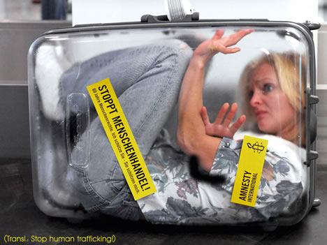
Amnesty International
The very successful players of Ambient/Guerrilla marketing are the charities, Amnesty International manages to find incredibly creative ways of getting their messages across. They manage to cause a reaction in an audience already over-bombarded with charity images and use a streak of reality in their campaigns, they really shock and disturb the audiences into fully understanding the situations Amnesty International is trying to prevent and leave an impression that will take a long time to wear off.

Viral/Public Stunt in Movie Theatre


