For this brief we have to create an alternate movie poster for a film (picked out of a hat) starring Bruce Willis. So the initial task is to look into existing alternative movie posters and get some inspiration from the design.
Posters

Clean and minimal, this design cleverly uses the well known figures on bathroom doors with a few minor tweaks in order to convey the most iconic scene from the film. It manages to get this across with no mess and fuss yet the simple design speaks volumes and sets the tone of the movie.
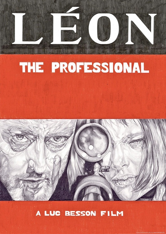
This poster has a detailed and illustrative look, it depicts an incredibly iconic scene from the film. It's detail and hand rendered look give it a rough edge which cleverly conveys the dark, edgy and realistic tone of the film.
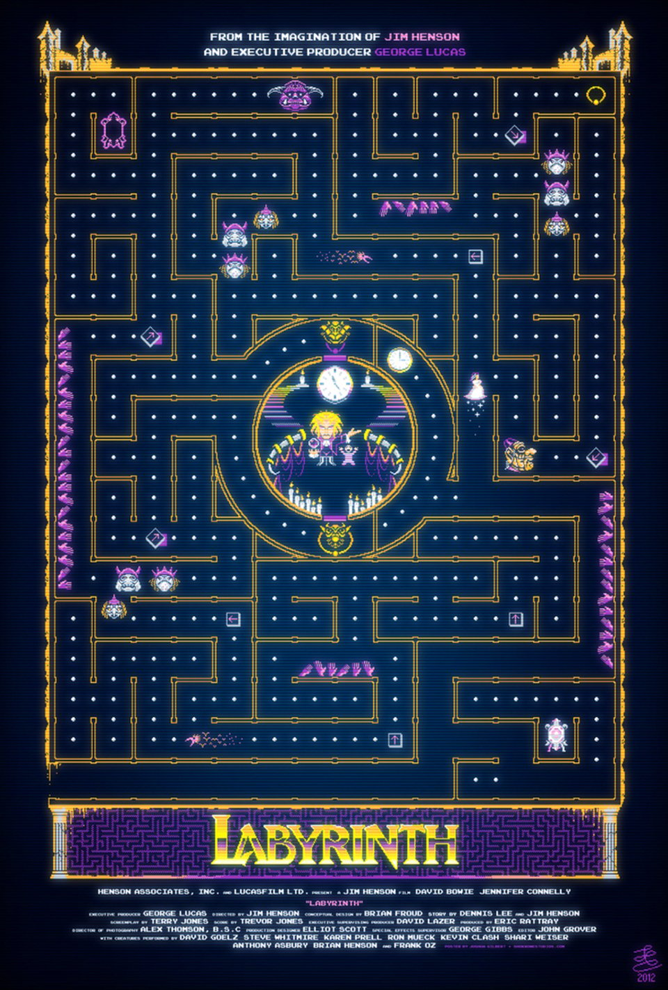
The design for Labyrinth is cleverly based off of the game Pac-man, depicting characters and specific scenes from the film, it communicates the tone of a children's film whilst also representing the films slightly dark and creepy nature.

This vectorised poster for Spirited Away depicts the character No Face, a key character and iconic design from the film. It's slightly creepy looking which is exactly what No Face is. The vectorised design also reflects the style of animation that the film is produced with, Japanese anime.
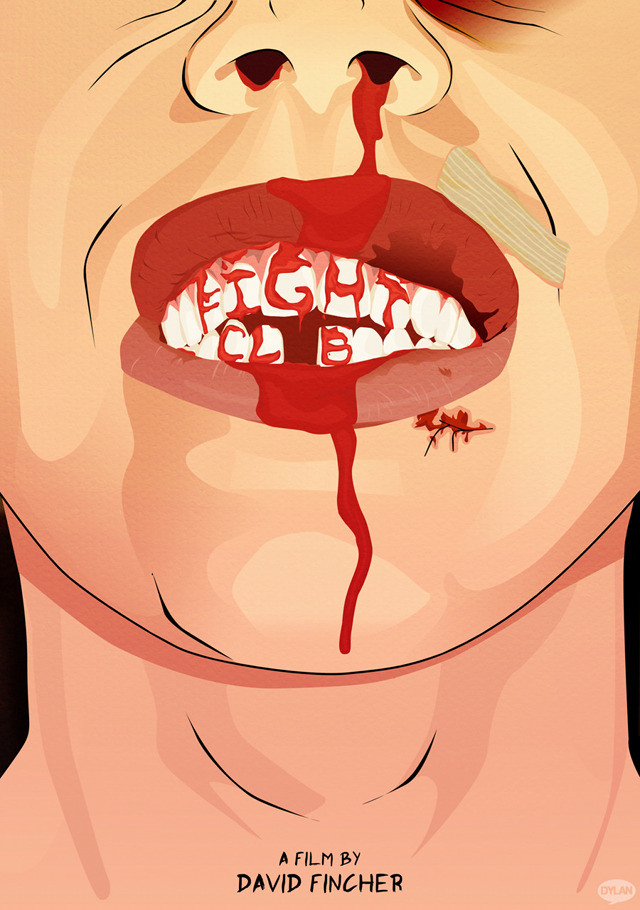
This illustrative poster for the film Fight Club cleverly merges the name of the film with an iconic scene, it sums up the film in incredibly simple terms, fighting, blood and violence, even the type at the bottom of the page looks as if it were written by an angry person.
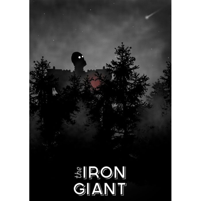
This wonderful poster depicts the main/title character as well as a few scenes where he is in the woods. This poster has such a warm and sentimental feel to it the trees bent in the shape of a heart and the soft glow represents the characters development throughout the film. The shooting star in the background also depicts a scene from the film when he arrives on earth and when he flies to save everyone.
'Superman.'
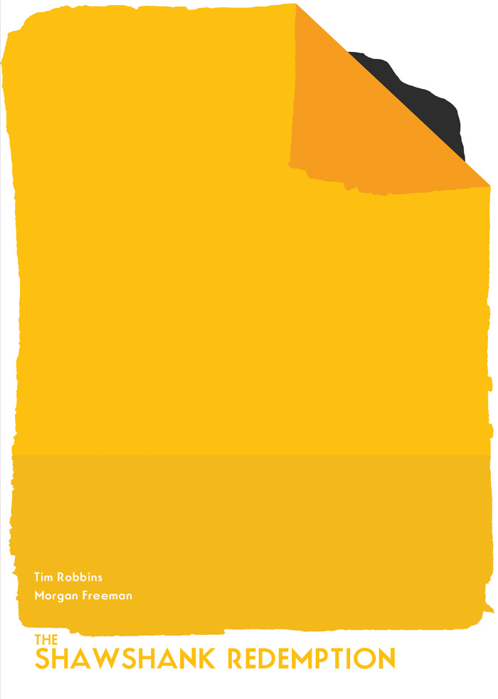
This very minimal poster represents a continuous theme throughout the film and is eventually how Andy escapes. It's so very simple yet incredibly effective tipping a hat to anyone that has seen the movie.
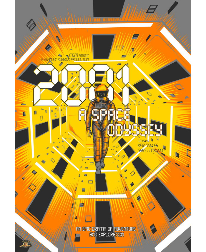
This poster for 2001: A Space Odyssey not only represents a very iconic scene, it also manages to convey the sense of loneliness and isolation felt by the main character after loosing his entire crew. The colour yellow gives us a sense of fear and danger both very present feelings throughout the film.
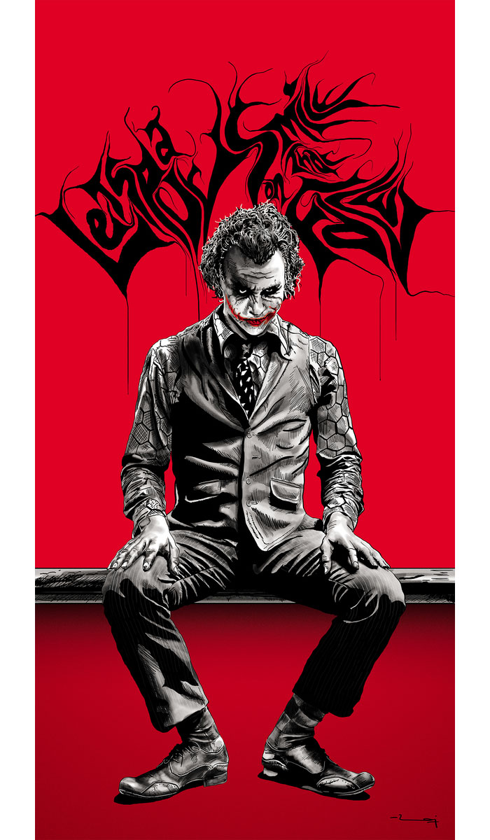
An iconic character, the Joker represents the second in the trilogy of Batman films. The colour red shows his chaos and the sense of danger he brings to the production and the splattered chaotic lettering behind him lists one of his famous lines from the film. It's so powerful in its representation of the film that the original title isn't needed.
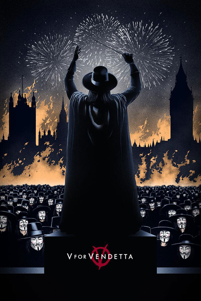
This poster shows two very iconic moments from the film, the explosion and destruction of the Old Bailey that starts the revolution and the crowd wearing masks as they march on the houses of parliament to their inevitable destruction at the end of the film, all in all it captures the start and finish of the British revolution. All with the title character 'conducting' it all. It's a very good representation of the story and tone of the film. It also manages a tip to the original comic with the style of drawing used in the design.
Overall Analysis
What seems to make a good alternative movie poster in all these cases is depiction of an iconic scene/moment/character as well as producing an interesting design. It seems to me that most of these posters are not aimed at drawing in a new audience but selling the image to someone who has previously seen and who love the film in question.