For this brief we have been asked to produce an item of graphic design that we would've felt beneficial in our first year of the course. Taking what experiences we've each had we now needed to think what we could produce, how could it help and most importantly of all, how can we make it personal.
For me this was an easy decision as I knew exactly what I would've needed through my first year and that's…
MOTIVATION
Throughout my time on the course there have been, and still are, so many moments of self doubt, lack of self belief and a general feeling of 'I don't belong here', and although this is something that I doubt will ever fully leave me, it would've been nice to be reminded by outside sources that I do deserve my place, or that I am capable of handling this without having to reassure myself. So despite not being able to actually stand there and shout motivation quotes at them I feel the most suitable format of delivery would be a poster, (with my target audience being students as well, a poster is a wonderful 'stick on the wall'/personalise your room form of graphics that we students can't get enough of)
Research
For my research I wanted to look into a range of motivational poster examples and motivational typography in order to determine, which fonts are considered the most motivational, which colours were considered motivational, the most appropriate tone and the general style/look of motivational posters.
Anthony Burill
An obvious choice, the master of the motivational print, however his work speaks for itself with its incredibly high popularity and his refreshing tone of voice take it a step away from the usual 'believe in your dreams' typography.


Other
Single Font Posters
Usually a simpler design the look is minimal and without fuss focusing only on the message. That being said the tone of voice feels a little cold, distant and demanding. There’s very little personality in these posters and they seem to simply state something towards you and not really care if you manage to do it or not.


Like with the multi fonts these posters care about how the message is said not just the message itself/ the hand rendered type gives the voice a strong humanistic quality and a friendly nature- like someone scribbled some cheery advice on the back of your not book. they don’t look as professional as the other two styles but they feel a lot warmer.


For me this was an easy decision as I knew exactly what I would've needed through my first year and that's…
MOTIVATION
Throughout my time on the course there have been, and still are, so many moments of self doubt, lack of self belief and a general feeling of 'I don't belong here', and although this is something that I doubt will ever fully leave me, it would've been nice to be reminded by outside sources that I do deserve my place, or that I am capable of handling this without having to reassure myself. So despite not being able to actually stand there and shout motivation quotes at them I feel the most suitable format of delivery would be a poster, (with my target audience being students as well, a poster is a wonderful 'stick on the wall'/personalise your room form of graphics that we students can't get enough of)
Research
For my research I wanted to look into a range of motivational poster examples and motivational typography in order to determine, which fonts are considered the most motivational, which colours were considered motivational, the most appropriate tone and the general style/look of motivational posters.
Anthony Burill
An obvious choice, the master of the motivational print, however his work speaks for itself with its incredibly high popularity and his refreshing tone of voice take it a step away from the usual 'believe in your dreams' typography.


Other
Single Font Posters
Usually a simpler design the look is minimal and without fuss focusing only on the message. That being said the tone of voice feels a little cold, distant and demanding. There’s very little personality in these posters and they seem to simply state something towards you and not really care if you manage to do it or not.


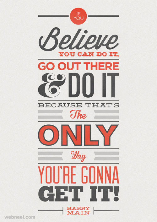
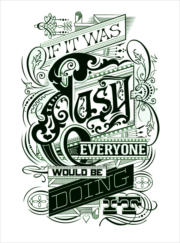
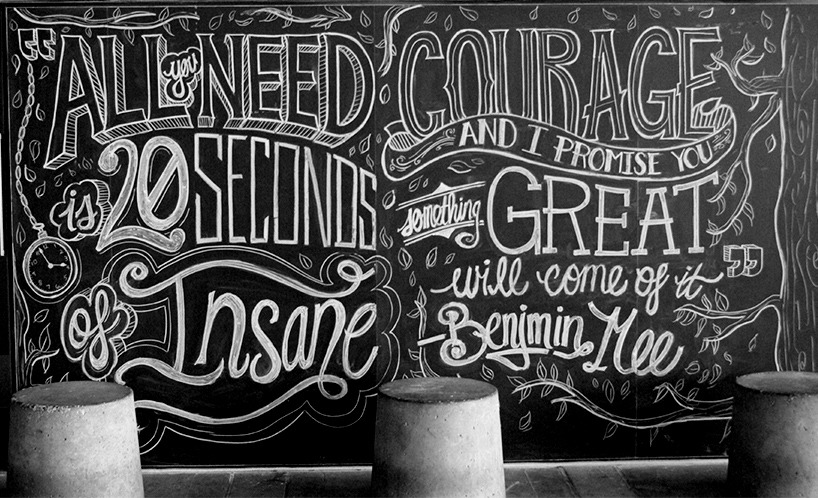
Multi-Font Posters
More personal and visually interesting, these posters try to look good as well as communicate a message. The tone of voice isn’t as demanding as the single font designs and feels on a whole a lot friendlier. There’s a slight aged look to them which I think helps soften the tone further, they’re not just giving you advice they’re speaking to you like a friend.
More personal and visually interesting, these posters try to look good as well as communicate a message. The tone of voice isn’t as demanding as the single font designs and feels on a whole a lot friendlier. There’s a slight aged look to them which I think helps soften the tone further, they’re not just giving you advice they’re speaking to you like a friend.


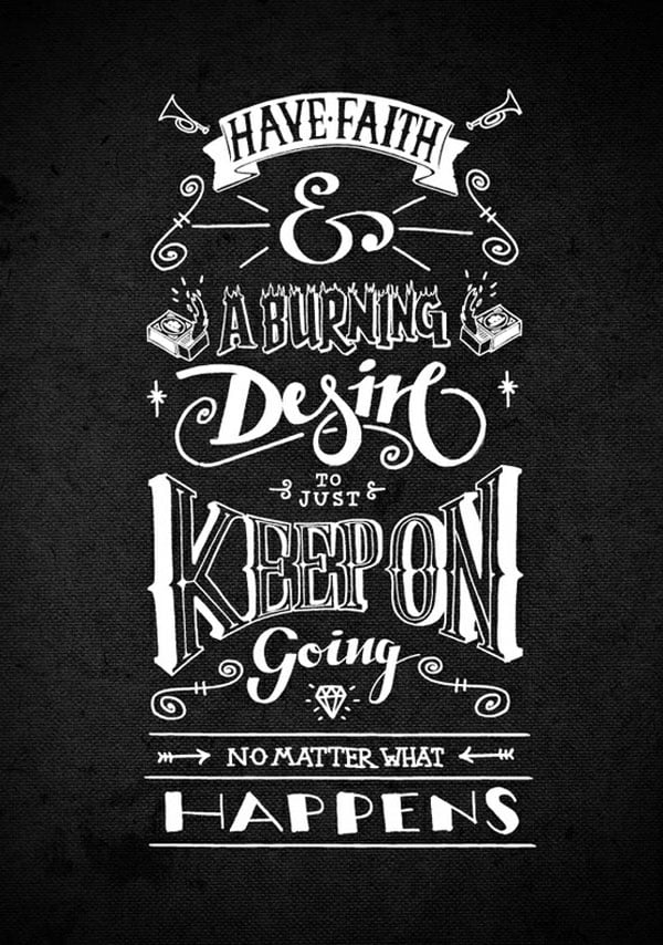

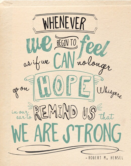
Hand Rendered Posters
Like with the multi fonts these posters care about how the message is said not just the message itself/ the hand rendered type gives the voice a strong humanistic quality and a friendly nature- like someone scribbled some cheery advice on the back of your not book. they don’t look as professional as the other two styles but they feel a lot warmer.


No comments:
Post a Comment